
I’ve included an engaging article, SEO metadata (meta title + description + focus keywords), suggested word count, image/visual suggestions, internal linking ideas, and a short CTA you can drop into your site. If you want it formatted as WordPress/Shopify HTML ready to paste, say the word and I’ll produce that next.
Every photo freezes a moment a laugh, a tear, a stolen glance. But a truly memorable photo album does more than collect pictures: it tells a story. At Alpha Designs, we transform photographs into crafted narratives that unfold page by page, creating heirlooms you’ll return to again and again.
Here’s how to approach album design as storytelling from the first impression of the cover to the final farewell on the last page.
1.Start with the Story You Want to Tell
Good stories have intention. Before you design a single spread, decide the narrative arc:
- Is it a wedding story (anticipation → ritual → celebration → afterglow)?
- A travel diary (departure → discovery → highlights → homecoming)?
- A family album (generations → milestones → everyday moments)?
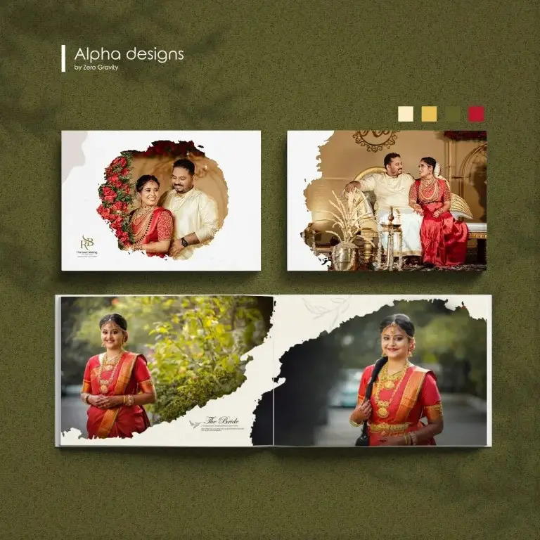
2. The Cover: Your Opening Scene
The cover is your book’s first line it sets expectations.
- Choose a strong image or a subtle, symbolic design (a close-up, a landscape, or a custom monogram).
- Think tactile: textured linen, leather, or a foil-stamped title invites touch.
- Keep it intentional the cover should hint at the album’s mood (romantic, adventurous, nostalgic).
3.Sequencing: The Rhythm of Images
Sequencing is storytelling’s grammar. Arrange photos to create pacing:
- Use wide, establishing shots to set scenes.
- Follow with medium and close-up shots to build intimacy.
- Alternate quieter spreads (calm colors, negative space) with busy spreads (crowd scenes, celebrations) to control tempo.
Resist the urge to include every image curation sharpens the story.
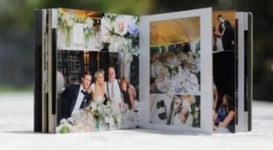
4. Layouts & Visual Hierarchy
A spread should guide the eye naturally:
- Use one dominant photo per spread as an anchor.
- Support it with smaller contextual images and captions.
- Leave breathing room; whitespace amplifies emotional impact.
5. Color, Tone & Consistency
Color and tone are emotional signposts:
- Match your photo edits for visual cohesion (consistent warmth, contrast, or desaturation).
- Use color palettes that echo the event: pastels for intimate ceremonies, saturated hues for festivals, muted tones for nostalgic family albums.
- If the album spans different days or lighting conditions, subtle color grading can unify the visuals.
6. Typography & Text When Words Matter
Photos tell much of the story, but words add clarity and context:
- Use short captions, dates, or a single-line quote to anchor moments.
- Choose typography that complements the album’s mood elegant serif for weddings, clean sans-serif for modern travel books.
- Avoid long paragraphs; keep text minimal and meaningful.
7. Incorporating Small Details & Keepsakes
Small elements make albums personal:
- Insert ticket stubs, pressed flowers, or mini-maps in a pocket page.
- Use textured endpapers or a timeline page to summarize key events.
- Add a “behind the scenes” spread with candid shots to humanize the story.
These touches turn an album into a multi-sensory memory.
8.The Last Page: A Thoughtful Conclusion
The final spread should leave a feeling closure, hope, or warmth.
- Use a reflective photo (the couple walking away, the last toast, a sunset).
- Include a brief note of thanks, a favorite quote, or the couple’s names and date.
- Consider a small “about the photographer” or “credits” page if the album is a professional production.
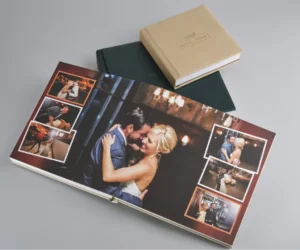
9. Print Choices That Preserve the Story
Paper, binding and finishes affect the storytelling experience:
- Lay-flat bindings highlight panoramic shots.
- Heavy archival paper ensures longevity and rich color.
- Soft-touch or textured covers enhance tactile pleasure.
10. Designing with the Reader in Mind
Think about who will leaf through the album:
- Family members may prefer clear organization and captions.
- Guests might enjoy dramatic visuals and highlights.
- Future generations will value durability and context.
Design for accessibility: readable type sizes, clean layouts and clear sequencing.